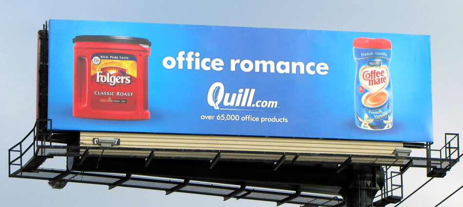
There’s an old saying in outdoor advertising that “seven words is one too many”. It’s a way of conveying that simplicity and laser-focused design is one of the key elements to a successful outdoor advertising campaign. The best out of home makes the most of that idea by making its simplicity its strength.
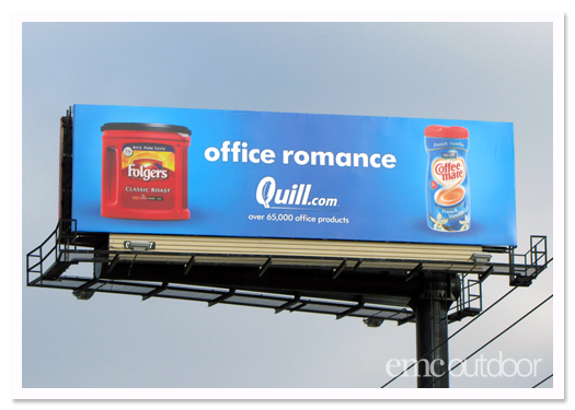
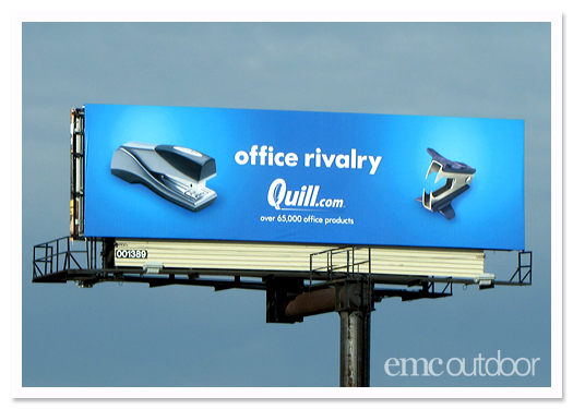
Quill’s “Office” campaign has all the elements of great out of home advertising: a simple, clever idea that can be understood very quickly with bold, striking visuals.
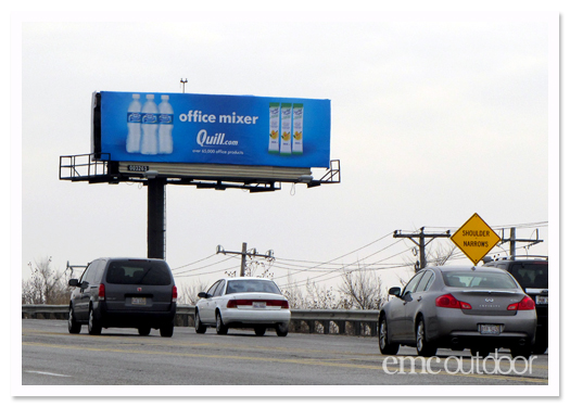
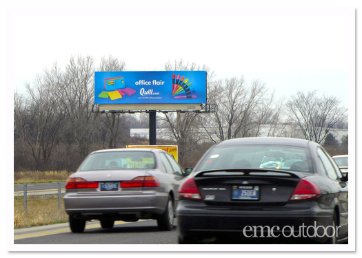
The graphic elements provide a humorous twist on familiar office-related phrases and create a visual pun that provides an “aha” moment for the viewer.
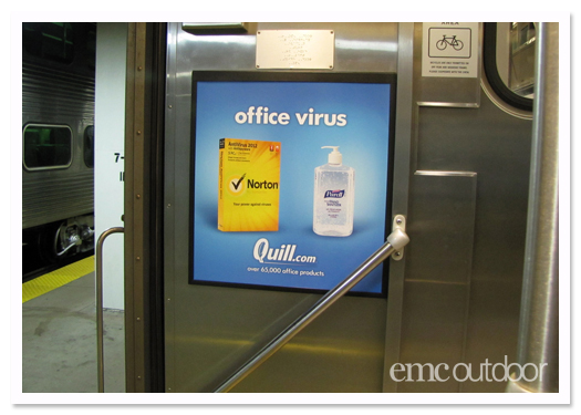
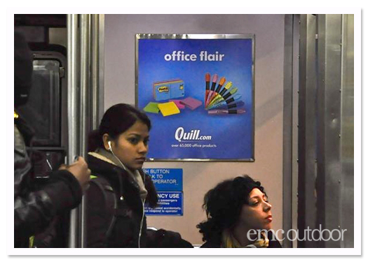
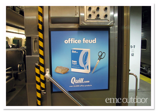
This campaign also uses another technique that works well with OOH: repetition with variation. Using the same basic idea in different versions makes the campaign more memorable.
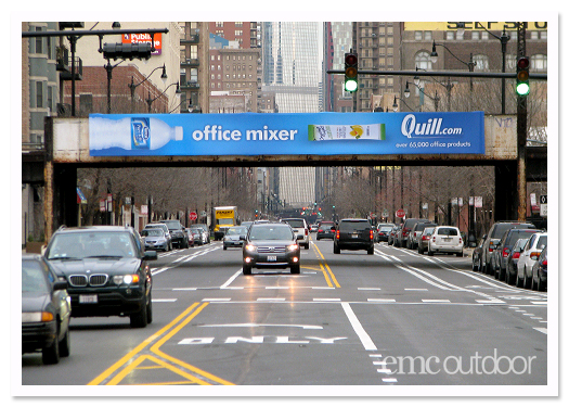
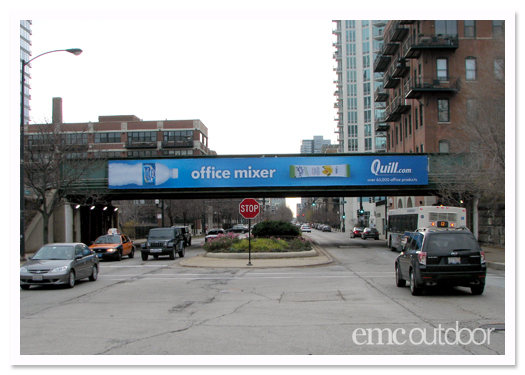
We were pleased to be a part of this exciting campaign for Quill. At EMC we specialize in helping you get your great OOH creative into just the right locations – contact us to learn more.

