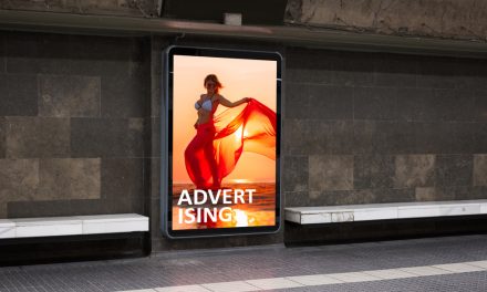
As advertisers, we’re often looking for ways to put branding on everything under the sun to reach our target audience. From typical formats, such as billboards and bus wraps, to more obscure formats, like a truck with a custom-fabricated snow mound on top or street teams dressed as reindeer handing out branded candy canes — anything is possible.
We understand that the consumer’s focus and attention is always in high-demand and that every brand is fighting for a slice of the pie. The American Marketing Association reports, consumers encounter up to 10,000 brand messages a day. They have an all-time low attention span and check their phone 150 times a day (APP LOCKET, Telemetrics Mobile Path to Purchase Study, 2014).
How can they possibly remember every advertisement they see? How can we be sure that consumers are seeing our brand message and are taking action? One major key for a brand who wants to stand out among the rest is good creative. Here are a few tips to develop creative that will grab your consumers attention and achieve your desired ROI!
3 Tips for Making Good OOH Creative
To start, let’s revisit a few fundamental principles that still ring true today. In 1983 the “Father of Advertising”, David Ogilvy, wrote in his book Ogilvy on Advertising, “Your poster should deliver your selling point not only in words, but also pictorially. Use the largest possible type. Make your brand name visible at a long distance. Use strong, pure colors. Never use more than three elements in your design.” While a lot has changed since 1983, these same ideologies have gone unchanged. In 2018, it is still important to stick to these fundamentals to make your ad both creative and effective.
Keep It Simple
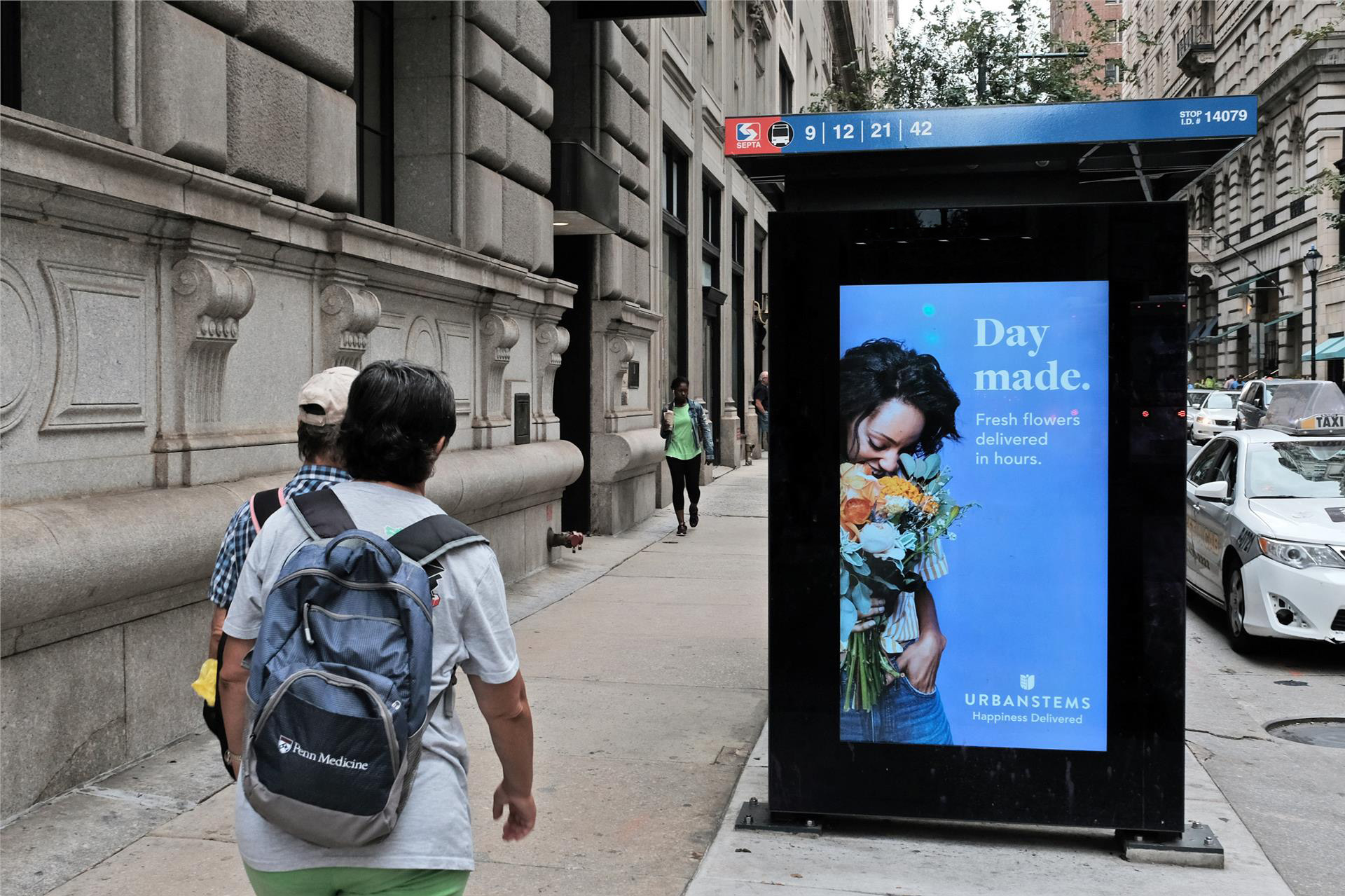
There’s the popular adage: seven words is one too many. This couldn’t be more true when it comes to good Out of Home creative. Often, advertisers feel the need to cram as much onto their 14’ x 48’ bulletin space as possible. However, to truly make use of an ad space, the messaging should be short, concise and easy to digest. In most cases, an advertiser has mere seconds of their audience’s attention to communicate a message. A brief, punchy message with an eye-catching visual element will go much further than a big, wordy block of text.
When audiences see an advertisement, they are usually on the move and performing numerous other tasks. Certain types of media can be optimized for longer dwell times. Subway and other transit ads can handle more words than, say, a billboard on the highway. When creating your ad, consider the media type and placement, as well as the attention span of the consumer.
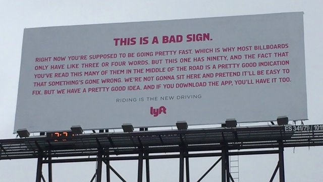
The above billboard from Lyft was an attempt to prove that overly wordy billboards are bad. It’s strategically placed along a highly congested highway, to be read by drivers stopped dead in traffic. It helps prove the point that it simply can’t be read during the typically heavy flow of traffic. (I should mention here, even though this ad breaks the ‘simple’ rule, it clearly gives Lyft some buzz and passers-by a taste of their brand voice.)
Keep It Smart
With your chosen media in mind, now it’s time to truly consider your audience. In 2018, most consumers are constantly connected to the digital world. Not only that—they are intelligent. With a click of an app, and a few seconds of typing, consumers have access to your website and social profiles. Your OOH no longer needs to include a website, directions or even a phone number. When your branding is strong, consumers will figure out how to get in touch with you. In fact, a study by USA Touchpoints said OOH reaches consumers in the same half hour as 23% of online mobile activity, which is more than any other traditional medium. Basically, almost a quarter of people who see an OOH ad use their phones to search, browse and buy.

Twitter recently utilized Out of Home to promote their platform by exposing some of the world’s largest current social issues. In the example above, they only used a clean image, a hashtag and their logo. They created a simple, effective way of encouraging dialogue about the polar ice caps. That’s all they need to get consumers to join the conversation.
Keep It Fresh
Once you nail down your media plan to reach your target demographic on a variety of platforms, you’re suddenly faced with artwork specifications and due dates. While it may be tempting to repurpose old ad creative, it isn’t always the best idea. Since good creative is as dependent upon relevance and timing as it is on what text and images to use, advertisers shouldn’t assume that an old ad will do. This is especially true when making the jump from a static ad to a digital ad.
Digital ads often provide additional features in creative, both visually and programmatically. Visually, the possibilities are endless—animated gifs, video, alternate messaging, etc. When programming creative, you can target specific groups of people at specific times and places. You can even target a singular group of people as they move about their day by running ads in each of the locations you know they’ll be. Nowadays, creative is instantly changeable based on the weather, time of day, social media trends, breaking news and more.
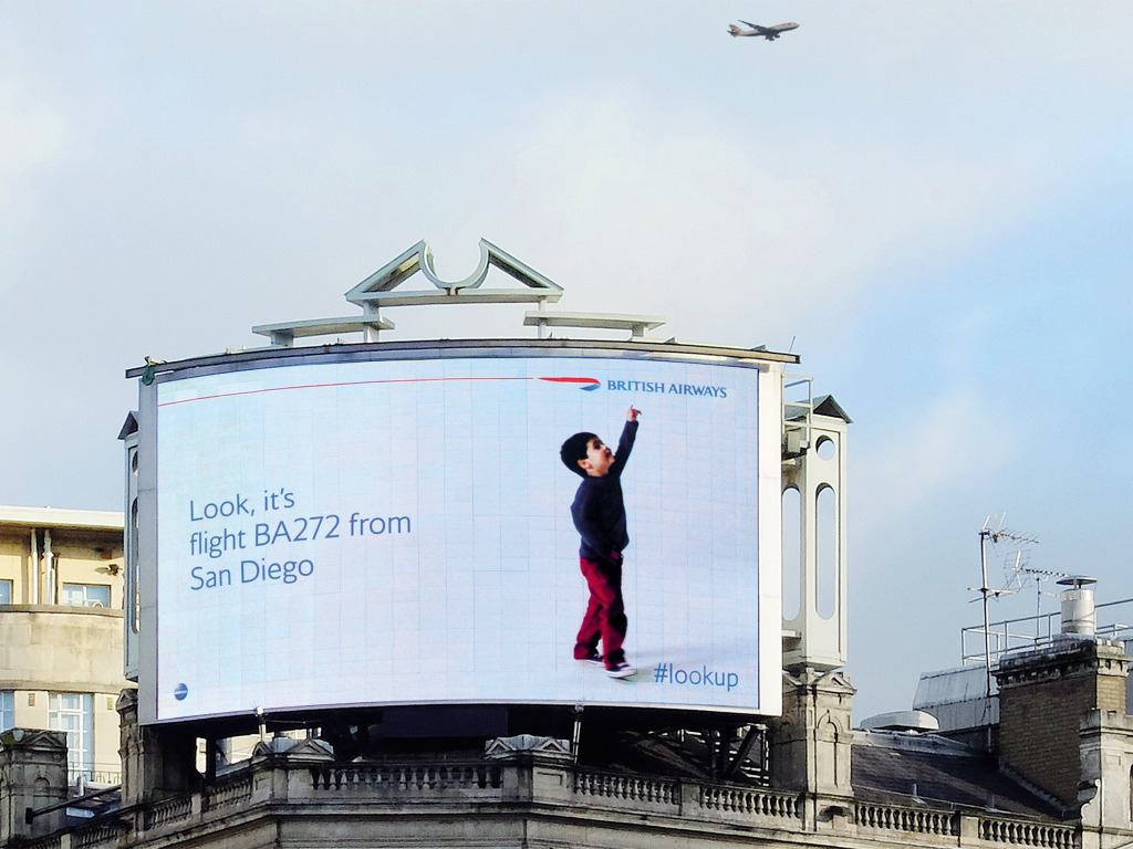
This creative from British Airways was groundbreaking when it was first released. Instead of placing a static ad on this digital unit, they took an innovative approach to the space. They leaned on the digital capabilities of the board to literally point to flights in real-time showing where they were going. It’s a catchy way for people to see the British Airways brand, gain a sense for how many of their flights arrived and departed the nearby airport, and have a unique, in-the-moment advertising experience.
Linking Good Creative to ROI
Good creative can yield the ROI results to prove your campaign’s success. A recent Nielson study detailed the percent of sales contribution by advertising element and reported that “creative quality is the most important factor for driving sales” taking 47% of the lion’s share. It’s no surprise that when the quality of creative is weak the sales lift is weak, and when you have strong creative it results in a strong sales lift.
As discussed in a blog post by EMC Outdoor’s CEO, Betsy McLarney, successful brands allocate an average of 13% of their total media budget to Out of Home advertising. While OOH continues to grow when it comes to most brands’ advertising mixes, it’s important to maximize the returns on investment and ensuring that you have quality creative will achieve your desired ROI.
Make an Impact
With all this in mind, it’s best to think about the creative from a consumers POV. Is your ad intriguing? Does it generate emotions or deeper thoughts? Is it captivating without being too wordy? Is it on-brand with your overall messaging and branding? Have you created an advertisement that is appropriate for your chosen media, utilizes the capabilities (if digital), and is simple? A great ad will stop the consumer in their tracks and cause them to buy a product, share a photo, or go on a trip. Now that you have the tools, go make some truly impactful creative!
Need EMC Outdoor to take a fresh look at your OOH creative? Contact us in the form below.


